Types of Charts in Forex Trading
There are three types of charts in forex trading: Line Chart, Bar Chart, Area Chart, and Candlestick. Let's explore all of them here and discover which one suits you best.
The use of price charts is the most important factor in tracking the price fluctuations of different assets in the financial market, including observing exchange rates in Forex trading. All types of Forex analysis, whether technical or fundamental, require the use of charts to assess the current market situation and predict future price trends. Therefore, Forex traders need to clearly understand the common types of charts that are often used, so they can choose the one that best fits their trading style.
Popular Types of Forex Charts
1. Line Chart
A line chart is the simplest type of Forex chart, created by connecting a line from the closing price of one period (Close) to the closing price of the next period. When these points are continuously connected, we can observe price movements as illustrated below.
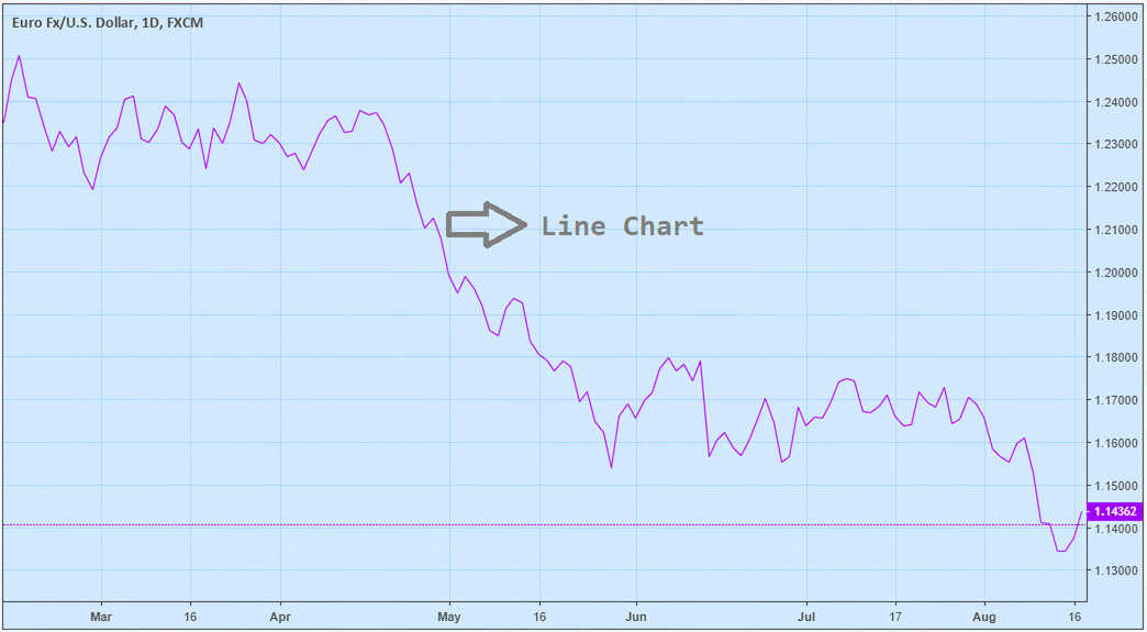
The line chart helps traders identify the main trend direction, whether it is bullish, bearish, or sideways. This trend is often used to build long-term trading plans based on fundamental or technical analysis, or trend-following trading strategies, helping traders determine if a currency pair is in an uptrend before they seek opportunities to enter trades.
Additionally, traders looking for breakout opportunities and those using support and resistance analysis also often use this type of chart to have a clearer and more visual view of important price levels.
2. Area Chart
An area chart is one of the types of charts used in Forex trading to describe price fluctuations over time. This chart is similar to the line chart but includes a colored area below the price line, helping viewers visualize price changes more clearly.
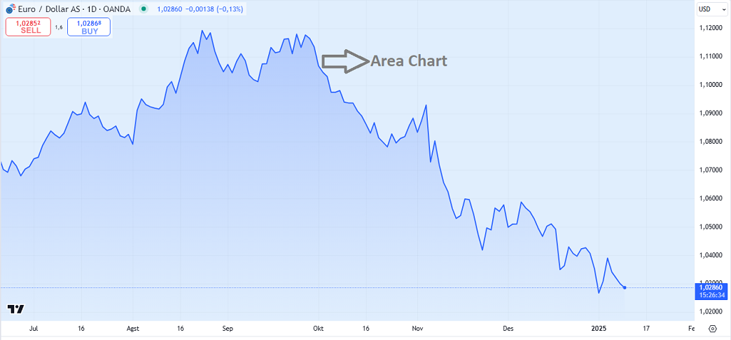
The area chart is often used by beginner traders or those who prefer a simple display interface. This chart highlights price movements clearly, thanks to the colored area beneath the price line, helping viewers quickly grasp the trend.
Traders who follow long-term trading styles or swing trading often use area charts to identify the main market trend. Additionally, traders relying on fundamental analysis (such as economic news or central bank policies) also use area charts to observe the impact of fundamental factors on overall price trends.
3. Bar Chart
Unlike the line chart that only shows the closing price (Close), the bar chart includes the opening price (Open), highest price (High), and the lowest price (Low). Therefore, the bar chart is often referred to as the OHLC chart (Open, High, Low, Close). An illustrative example is as follows:
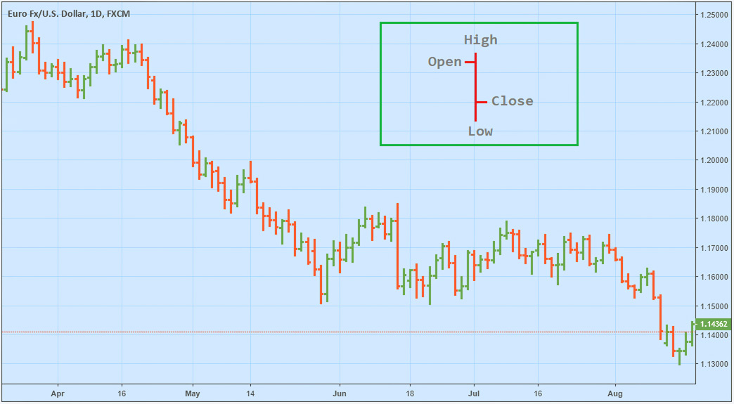
The left tick of the bar represents the opening price, while the right tick represents the closing price. The bottom of the bar shows the lowest price, while the top shows the highest price over a specific period. This period can vary depending on the timeframe chosen by the trader—e.g., 5 minutes, 10 minutes, 15 minutes, 1 hour, 1 day, or 1 month.
Technical traders, especially those focusing on price action analysis, often use bar charts because they provide more detailed information from price movements.
4. Candlestick Chart
The candlestick chart provides detailed information about price movements over a specific period similar to the bar chart, but in a more visual and readable format. The OHLC data is displayed in a "candlestick" format, with the wicks representing the highest and lowest prices, while the body of the candle shows the difference between the opening and closing prices.
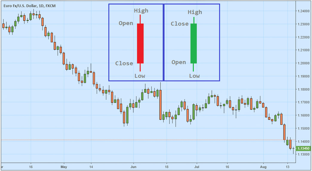
If the opening price is higher than the closing price, it means the price has decreased, forming a bearish candle (colored red). Conversely, if the opening price is lower than the closing price, it means the price has increased, forming a bullish candle (colored green).
Typically, this type of chart is often used by technical traders to observe or identify candlestick patterns, serving as a basis for determining entry points for trades.
Which Chart Type is Best for Forex Analysis?
Among the four types of Forex charts above, most traders use the candlestick chart because it provides comprehensive information and is easier to read. Additionally, candlestick charts can form candlestick patterns that predict potential reversals in price movements, often considered high-accuracy trading signals.
Not all Forex trading platforms display candlestick charts by default. If the chart on your trading platform is still in the form of a line chart or bar chart, be sure to manually switch to a candlestick chart. Typically, the option to change this chart type is available in the menu bar or display settings. You can also customise the colours of bullish and bearish candles, not necessarily using green and red.